


How fast must a business grow?
Investors have different expectations for growth rates, returns, and their own patience.
In our last newsletter we concluded that Netflix’s newly positive cash flow would have to grow faster than was plausible if it was to justify its current valuation.
Netflix is not alone. We reach the same conclusion about all currently fashionable technology stocks. But this can’t be a universal view. If it was, there would be no buyers at current valuations, and prices would fall.
Hard to please
The explanation is simple: Pier Analysis is applying more demanding criteria than other people. This is intentional. The aim is to sift out a small number of companies with prices so attractive that they provide a large margin of safety against the possibility that we have got our sums wrong.
In every article we have been open about this deviation from the norm. Distinctively, Pier Analysis shares the numbers underpinning its thinking by offering its financial models for download, and it has encouraged readers to use the spreadsheet to explore the effects of less demanding criteria.
Something new
We recognise that not everyone wants to engage in the faff of downloading spreadsheets and interrogating them, so we have developed a simple chart that can show the effects of different investment philosophies in an easy to read form.
We’ll show that chart in a moment. Before we do, let us recap on what’s distinctive about Pier Analysis’s approach.
Banks won’t lend money to a business unless they are confident that it will be able to repay the debt. Equally, individuals would be unwise to invest money in a company that has no prospect of returning it to them. You might think that you can always get your money back by selling the stake to someone else, but there will only be buyers if they believe that the company can eventually pay back to them or anyone they sell on to. The question is how long we should give the company to return our investment. Pier Analysis looks for companies that could plausibly generate cash sufficient to pay it back within fifteen years. Most analysts allow a much longer time. [1].
We don’t just want our money back. We want some extra on top, to compensate us for the risks of tying up our cash and perhaps not recovering it all. We can say that as well as a return of our capital, we want a return on it. Pier Analysis looks for returns of 10% pa. Most analysts are content with less. [2]
So any exhibit that aims to contrast Pier Analysis’s outlook with a more conventional one needs to have some sense of how long we are willing to commit to the investment and some sense of rate of return.
Imagine a company has an enterprise value of $800m, and it is generating $40m of annual cash flow.
Those investing now have to wait twenty years before their share of the cash flow will have accumulated to the point where they have broken even.
Before that time, their cumulative cash return is negative; they have received less than they put in.
21 years into the future, investors who put $800m in now will have got $840m out. We could say in simple terms that they have now made 5% on their investment ($40m of profit / $800m of initial investment). Since that 5% took 21 years to arrive, in annual terms the return is 5% / 21 years which is 0.24% pa.
A more sophisticated measure, the IRR, for internal rate of return, captures the 21 years that it takes for this $40m to be earned in a more mathematically thoughtful way. The IRR that results from getting 21 years of $40m from an $800m investment is 0.45%, in the same region as our simpler estimate, but a slightly different value.
We can work out the IRR that results from holding this steady investment for various periods.
Click or double click the charts in this article to make them larger and more readable.
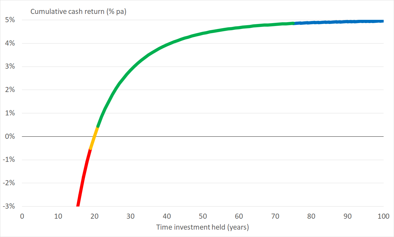
Highlighted in red: Below 20 years, the IRR will be negative, consistent with the idea that we have yet to earn back our initial investment
Highlighted in orange: At 20 years, the IRR is zero, showing us breaking even
Highlighted in green: Over longer periods, the IRR becomes positive, as our company has now delivered more cash to us than we put in.
Highlighted in blue: If we hold the investment for a long time, approaching 100 years, each successive year has a smaller effect, resulting in the IRR leveling off as it approaches 5%. That is no coincidence: we are getting the 5% yield implied by $40m of annual cash flow from our $800m investment.
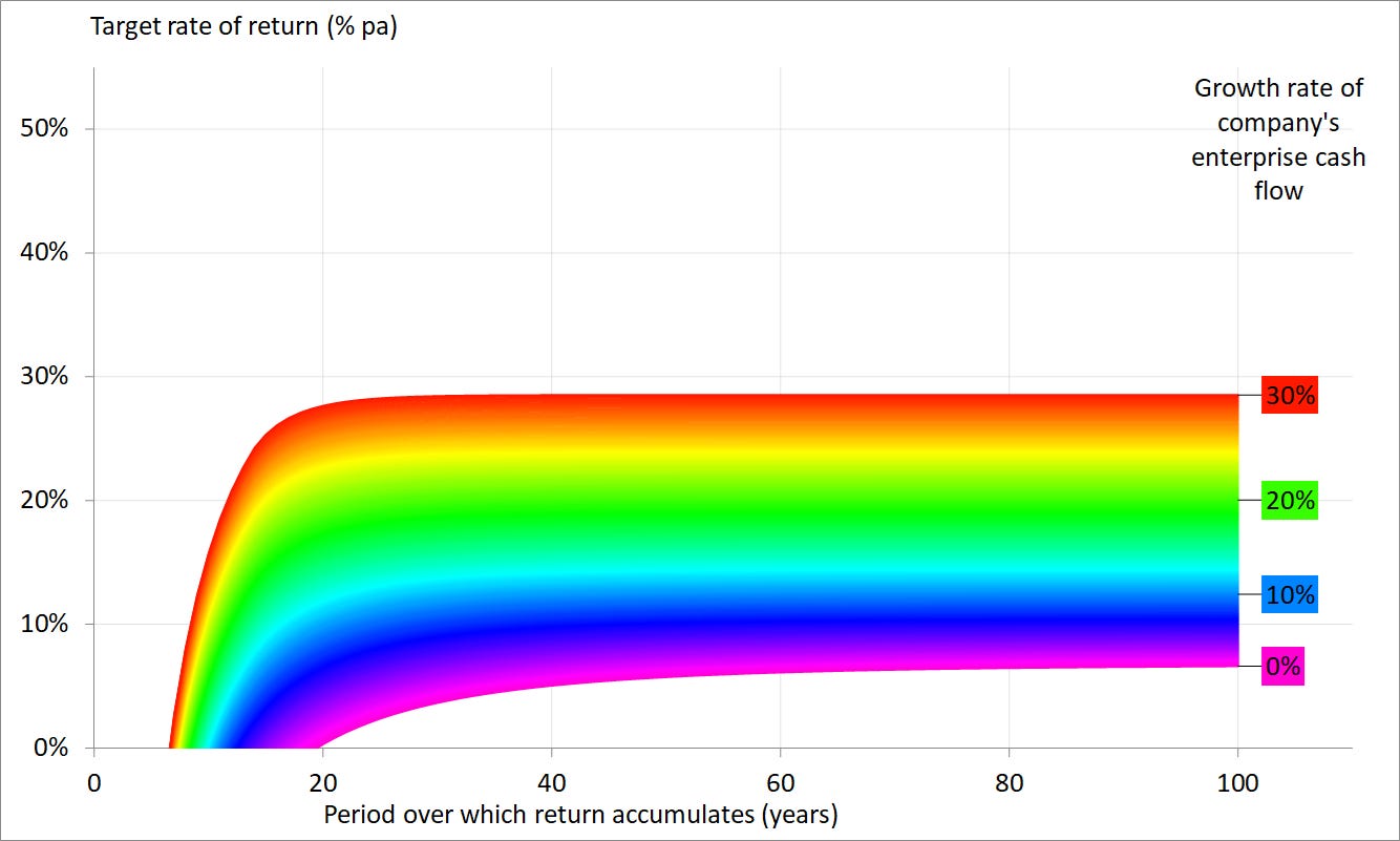
Now we are going to draw a second line on the graph. As before, it’s the IRR of the result of investing $800m in the business, and taking its annual cash flow over ever more years; but this time, the cash flow is growing at 30% pa, which is very rapid. It leads to us breaking even much earlier than before, in 7 years rather than 20, and to our IRR climbing towards a little over 35% pa, which is the result of combining the 5% initial yield and the 30% pa growth rate.

Having set these extremes, we can fill in the intermediate lines. This version of the chart has 240 lines, spaced apart very finely, at growth rates between 0% and 30%, and using the colours of the rainbow to make it easy to see the patterns.

High growth is possible only for a while
There’s just one problem with this graph. Its upper part contemplates high rates of growth that continue indefinitely. No business can grow rapidly forever.
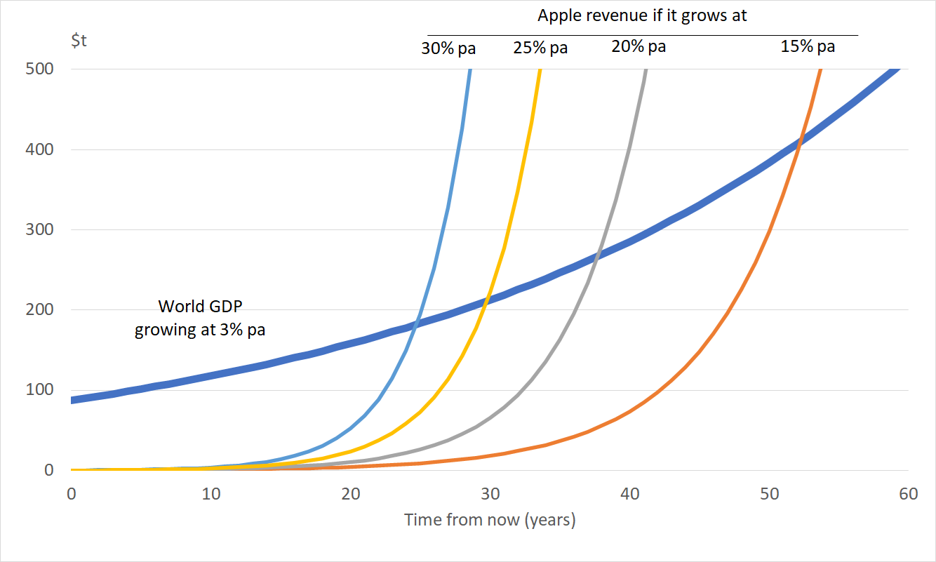
Take Apple. At the moment, World GDP is around $87,550b. Apple’s revenue is about $275b, so it accounts for about 0.3% of the world economy.
The long run growth rate for world GDP is around 3% pa. Technology stocks are prized as a result of the belief that they can grow faster than this. But if Apple managed to grow consistently at 30% pa, it would pass world GDP from other sources within 25 years, becoming the majority of the economy, which is clearly nonsense. Growth rates of 25%, 20% or 15% would take longer for this phenomenon to appear, but it would do so eventually.
If we make this point graphically using a linear scale, the growth is shown in the upward curving lines.
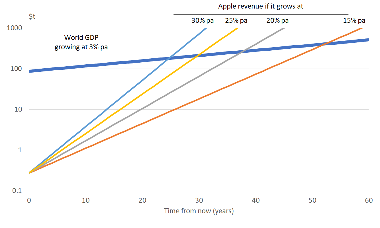
If we draw exactly the same information on a logarithmic scale, the growing lines straighten out, which some might find a clearer presentation.
We can see that it is unrealistic to assume that any business can maintain extreme growth rates continuously for decades at a time. It’s certainly not something to bet on. Even at Apple, where growth in the past has been extreme enough to take it from formation in a garage in the 1980s to one of the world’s largest companies, revenue is just 17% higher in 2020 than it was in 2015. That is a compound rate of 3.3% a year, which is not noticeably more than GDP growth.
We therefore adapt our chart by allowing growth to occur at high rates for no more than fifteen years. Growth after that continues at just 3% pa, which is intended to represent inflation and/or GDP growth. Drawn on this basis, the chart flattens out at a lower level than before because the growth is occurring for a shorter time.
Practical application
Now we apply this chart to Netflix. As we saw last week, it had (then) an enterprise value of $251b and is generating cash flow of $2.4b.

We have marked two points on this graph.
Point A is what Pier Analysis would look for: a return of 10% pa, achieved within fifteen years. It lies beyond any of the coloured lines, which means we need to believe that Netflix can grow its cash flows at over 30% pa for the current valuation to make sense to us.
Point B is what other investors would look for. We’ve used 5% pa to represent the lower rate of return that they are willing to accept, and 100 years to represent the almost indefinite period over which they are willing to allow this return to accumulate. [1,2] This point B lies on a light blue line, which means that at current valuations conventional analysts would need to believe that Netflix can grow its cash flows at 10.7% pa for the next fifteen years, and then stay at that size for the rest of the coming century, growing at 3% pa along with the rest of the economy.
Sustained growth faster than 30% pa is highly implausible, which is why Pier Analysis judges Netflix too expensive according to its criteria.
The lower 10.7% pa growth rate implied by point B is more nearly plausible. We saw that growth ranges from 63% pa in Netflix’s Asian markets down to 11% in the mature North American market. These growth rates concern revenue. Cash flow, which is what interests us here, will grow faster because a decent fraction of costs are fixed. These points make Netflix a more nearly reasonable prospect from the point of view of traditionally brought up investors. Against this, Netflix needs to maintain growth at that rate for a full fifteen years, and remain at the resulting larger scale for decades after that.
It's worth observing that nothing in the coloured parts of these charts is subjective. The shape of the lines is a mathematical inevitability that flows from the ratio of the business’s enterprise cash flow, which we derive from the accounts, to its enterprise value at the moment of analysis, and our decision to confine growth to the first fifteen years. Points A and B are set by the different parties’ preference for investment period and target rate of return, which are of course the result of subjective judgments and divergent philosophies.
These charts bring home the extent of Pier Analysis’s conservatism. Dissenters will protest that with this outlook everything will appear too expensive. To them we say: at various points in the last decade, each of Apple, Microsoft and Alphabet (Google) has looked appealing against these criteria. All were out of fashion at the time. Those who invested in them at that moment have enjoyed almost tenfold gains. For UK holders, the gain is yet larger because the pound has fallen relative to other currencies, making dollar assets more valuable over the holding time for these investments.
What’s next
We intend to include this chart in articles going forward. We’ll value reactions, by email (if you got this by email: just click on reply) or the comments section beneath the web version of this article.
As usual, we are willing to provide the spreadsheet that generated these charts. This one is extremely simple and involves no complicated maths or any accounting at all. If you would like to receive one:
if you have not done so already, subscribe to Pier Review by using the box below
click here to pre-populate a message in your usual email program requesting that the spreadsheet be sent to you
switch to your email program and click Send to despatch the request.
If you find this analysis interesting, you can sign up to have others like it delivered to your inbox several times a month.
Share Pier Review with interested friends.
Notes
[1] Banking and stockbroking analysts follow a method they were taught at business school. Their valuations include what is known as a terminal value, which is a figure that represents all of the juice that remains to be squeezed out of a business after some future moment, typically ten years away from now. The formulae used to calculate these terminal values are equivalent to believing that companies will continue to generate cash forever. Being content to have one’s capital returned over an infinitely long time is indistinguishable from accepting that it should never be returned.
But companies are not immortal. Compare any of the major stock exchange indices now with twenty years ago, and the composition will be seen to have changed substantially. Companies leave the index as a result of underperformance, take-over or bankruptcy. Others enter the index because they have grown impressively and now meet the criteria for inclusion.
A recent study by McKinsey found that the average life-span of companies listed in Standard & Poor's 500 was 61 years in 1958. Today, it is less than 18 years. McKinsey believes that, in 2027, 75% of the companies currently quoted on the S&P 500 will have disappeared.
In our opinion, being willing to wait indefinitely for a company to return one’s investment is particularly unwise for fast-growing technology stocks. It is contradictory to believe that a company such as Netflix will continue to upend established providers, but will itself carry on serenely into eternity. If a sector is capable of disruption on that scale, it is highly likely that someone new will be along in a decade or two to inflict the same pain on the company that is currently now blossoming. While it’s hard at the moment to imagine a world in which Apple is not a force, there was a time when the same could have been said about IBM. Or Blackberry, or Nokia, and a host of companies that are a husk of their former selves.
The question is not whether businesses might not buck the trend and flourish for decades more. They might well do. Several of the major oil companies can trace their lineage back over a century. The question, rather, is whether it is sensible to commit a decent portion of your family’s fortune and security to the bet that a company will continue to prosper decades ahead, when the world may differ from today in ways that are hard to imagine.
Pier Analysis is not at all willing. It looks for companies that are valued sufficiently modestly that their cash flows are capable of repaying the investment within 15 years. Why 15 years? There are two reasons.
Though the McKinsey contribution cited above suggested 18 years, more widespread estimates are that a typical quoted company endures for thirty years, and the average one of those will be half-way through that period.
Pier Analysis comes from the world of project finance, the method for raising money used to pay for the development of natural resources, energy and infrastructure. There exist funds which specialise in this kind of asset which in Pier Analysis’s view are safer homes for individuals’ money than more speculative ventures. Why guess how successful Netflix will be in penetrating the world’s entertainment industry when you could hold a small piece of your local hospital? These alternative outlets for your money do have finite lives: mines get depleted, oil wells run dry, and concessions to own and operate infrastructure come to an end. Thirty years is a typical project duration, and the average project will be half way through that timeline.
[2] Pier Analysis looks for a rate of 10% pa because that is the kind of rate on offer from the funds that specialise in holding infrastructure assets, and which it thinks are the alternative homes for investors’ cash against which other opportunities should be compared. Other analysts will look for less, either because they are applying the capital asset pricing model, a dogma taught at business schools which will use some maths to come up with a rate likely to be lower than 10% pa; or because they consider any yield at all an improvement over bonds and bank deposits which are delivering essentially nothing.