


What the colours mean
The exhibits in our most recent article were yellow rather than green. Here's why.
Warning lights
A distinctive feature of Pier Analysis is that it is willing to share its workings by supplying its model. The exhibits in its articles are screenshots from the model. They are characterised by horizontal stripes that identify and delineate portions of the analysis. Normally they are green, but in the article on DX (Group) plc, published today, they are yellow.
The reason is that these stripes change colour like a traffic light.
Normally they are green to show that all is well
If the model is in a non-standard state, they warn of the fact by turning yellow
When there is an error condition, they signal it by turning red.
Do you believe the projections?
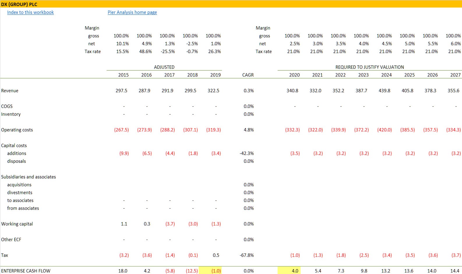
So what is it about DX that requires us to supply the model in a non-standard state? It has to do with the worksheet called Direct cash flow.
The left side of the worksheet shows DX’s pattern of cash flow generation in the last five years.
The middle portion of the worksheet restates these historic numbers, adjusting them by eliminating items that cannot be depended upon to recur, to gain a sense of the business’s underlying performance.
The right side of the worksheet extrapolates the adjusted cash flow into the future.
In most projections of this kind, the analyst seeks to be as accurate as possible. An ideal forecast would predict future cash flows perfectly. That’s difficult to accomplish and requires lots of skilled judgement.
Pier Analysis’s approach is simpler: it shows how the enterprise cash flow has to grow in order to justify the current valuation, that is, deliver a net present value that matches the firm’s current enterprise value. This requires no skill at all; it is a mathematical inevitability once you have decided how many years to include and a target rate of return at which to do the discounting. The judgement call is left to the reader, deciding whether the projection is plausible or not. In most cases the projection will be very obviously implausible.
In search of positive cash flow
So the right side of the direct cash flow is the result of allowing to grow into the future what we have determined to be the adjusted cash flows in the recent past. In DX’s case, recent cash flow is negative, making it an unsuitable starting point for our projection. Any value that we derived from extrapolating that would be negative also. There is no growth rate that would get it to match the positive enterprise value that DX now enjoys.
It’s often the case that the most recent adjusted cash flow isn’t a perfect launch point for our projections. The model allows for this possibility by providing a means of scaling the cash flow. Normally the scaler is set to 100%, but if we wanted to use double the most recent year’s cash flow before using it to establish our projections, we would set it to 200%.
In the case of DX, we scale the historic cash flow by -300%, which takes the 2019 negative figure of (£1.0m) and both flips its sign and makes it quite a bit larger. From the resulting £3.0m, we get the sequence £4.0m, £5.4m etc by growing that cash flow at the brisk clip needed to justify DX’s valuation. These are highlight in yellow in the bottom row of this extract from the cash flow.
We will have to make a similar intervention in every analysis that we publish of companies that have negative cash flows.
It will do it for you to
This cash flow scaler is just one of several scalers provided by the model, to facilitate different kinds of manual intervention.

Whenever any of the scalers are set to a value different from 100%, the model considers that it is not in base case conditions. Rather, it is running a sensitivity, and it signals the fact by describing the sensitivity at the top of every worksheet, and turning the horizontal stripes from green to yellow. It will do exactly the same if you run a sensitivity of your own through the model, which Pier Analysis encourages you to do.
What’s next
A distinctive feature of Pier Review is that it provides the financial model that underpins each analysis. To receive the spreadsheet relating to DX
if you have not done so already, subscribe to Pier Review by using the box below
click here to pre-populate a message in your usual email program requesting that the spreadsheet be sent to you
switch to your email program and click Send to despatch the request
If you find this analysis interesting, you can sign up to have others like it delivered to your inbox several times a month.
Share Pier Review with interested friends.